

Ink Tank
UX DESIGN CASE STUDY
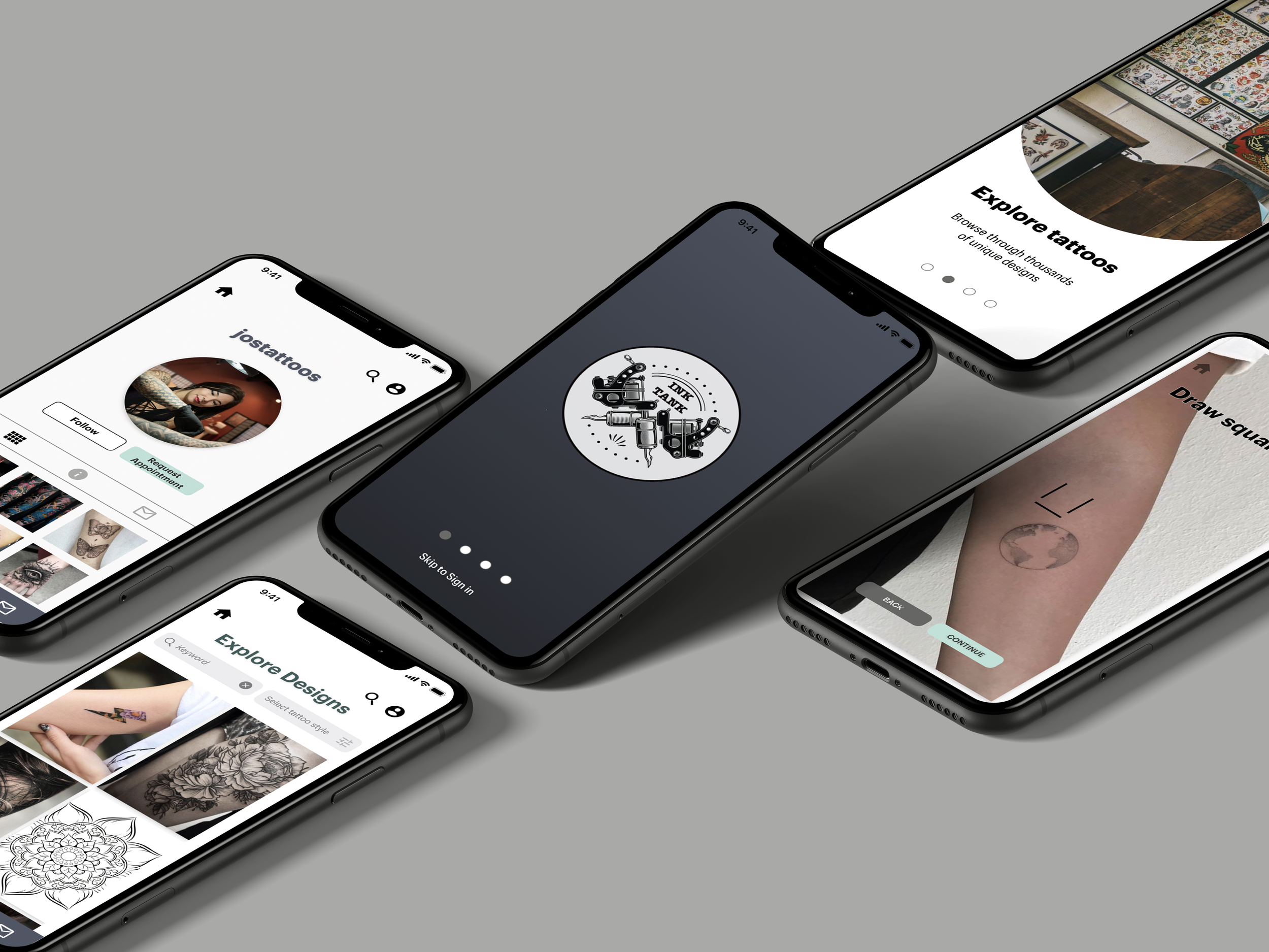
Ink Tank is a responsive app for tattoo enthusiasts that want to explore tattoo designs, communicate easily with artists, book an appointment, and virtually preview tattoos on themselves before getting one.
Challenge
Getting a tattoo is a permanent decision, so the whole process can be overwhelming. Luckily, there are many designs and artists to gain inspiration from. However, how can the search be narrowed down to not overwhelm users? Is there a way to converse with and establish trust with an artist? Is there a way to see how the tattoo will look like on a person before permanently committing to it?
A Solution
Tattoo enthusiasts need one convenient place to discover inspiration for a tattoo by browsing designs, to easily communicate with artists, and see how a tattoo will look before getting one so the tattoo process will be made easier. We will know this to be true when we see an increase in interaction with artists and previewing tattoos on photos.
Tools
Role
UX/UI Designer
UX Researcher
Adobe XD
Adobe Photoshop
Balsamiq
Optimal Workshop
Usability Hub
Design Process
Before coming up with solutions, it was important to research who would be potential users and the competition to get inspiration. From there, user personas can be crated. From those personas, multiple solutions can be made which are translated into prototypes. These prototypes are then tested on users for a final design.

RESEARCH
Competitive Analysis
Completing a competitive analysis is beneficial to the research because it can show what can be done to be improved and frictions to avoid. There are not many apps of this kind on the market. We can create a great product, but without many apps to compare to, frictions will be limited to solve.

Interviews
To research and discover more about potential users, I conducted user surveys and interviews.
Research Goals
To better understand the user behavior on tattoos and the inspiration and motivation to get one.
To determine what criteria users are looking for in a tattoo inspiration/tattoo finder product.
To document friction of competitive apps.
To discover the likeliness of a user regretting a tattoo and factors that lead to that attitude.

Notable Quotes
Users want the tattoo inspiration search and communication with an artist to be easier. They want search features to include style, artist, area, and price. Also, they want to feel a personal connection to the whole process.
They would not mind spending extra time finding a good artist that fits their needs.
The tattoo journey is very personal, so users want to feel like the search is unique to them and feel emotionally connected to the process.
Participants want a product that makes the technical parts of getting a tattoo to be easier because it is a stressful situation already.
User Personas
The personas were created from the competitive analysis and initial user interviews. The notable quotes were taken into consideration when creating the personas.


WIREFRAMES AND TESTING
Site Maps
I recruited 5 participants for some card sorting sessions, which uncovered several patterns and trends on how users would engage with the app. Using this data, I revised the sitemap for my app.


Wireframes
I started my wireframing process with pen and paper sketches of the main features of the application. Then I transferred these sketches to Balsamiq to have cleaner and presentable wireframes. From Balsamiq, I created my high fidelity wireframes using Adobe XD and continued to add in some details to the wireframes.
The images below are examples of the development of the wireframes, from low to high fidelity.

Splash Screen
The splash screens went through a few changes during the design process. From the usability and A/B testing, I found that users did not need a "Next" or "Back" button to go through the screens because it was intuitive to swipe to the left and right to go from screen to screen. It was also noted that the design looks sleeker without the buttons.

Artist Homepage
The Artist Homepage went through quite a transformation during the design process. An artist's avatar, sample images, and follow button were near each other to illustrate that they were all related, but users expressed that it looked jumbled together. The final design includes all the content mentioned previously in its box, so the separation is more apparent.
Usability Testing
Using Adobe XD, I created my interactive prototype and conducted usability testing with 6 participants. I sorted the results using affinity mapping and transferred the information to a Rainbow Spreadsheet.

Takeaways
The following are some of the issues that were highlighted in the test results:
Issue 1: The screens did not scroll.
Suggested Change: Enable the scrolling feature so the screens are not static.
Evidence: For all the participants, it was intuitive for users to want to scroll down to see more of the screen. 3 of the participants were vocal about wanting to scroll, from observing the participants, all of them tried to scroll down when using the prototype. Adding the scrolling feature lets the users easily see more designs within the same screen without having to click on another page to get to other images.
Issue 2: The icon labels were difficult to read.
Suggested Change: Removing the labels underneath the icons altogether.
Evidence: Most users said everything was straightforward. Eliminating the names would be less cluttered and users will be able to explore the app buttons and discover what each leads to on their own.
Issue 3: Finding the board button/access the board was difficult.
Suggested Change: Change the bookmark button that was used for a board button to a “Board” button or a save button that drops down so users can easily save designs to boards of their choosing.
Evidence: All the participants commented on the board button. They were able to figure it out but they wanted a drop-down menu and an icon or button that better represents saving the design to a board. The button to save the design to the board is straightforward and pop up comes up instead of loading another page that was in the prototype’s first design- it’s fewer screens that the user has to click through.
VISUAL DETAILS
Design Language System
I put together I design language system document to help maintain consistency and communicate brand guidelines with any future design iterations.


INTERACTIVE PROTOTYPE
REFLECTION
The prototype that the users interacted with during the testing had icons and icon labels below. From the feedback, it came to light that the icon labels were difficult to read, so I removed them. The icons have to be intuitive to the users so labels are not needed.
The feature of trying on a tattoo was well received because the target users are more likely to get a tattoo so having a visual of it intrigued the users. Also, having splash screens that quickly described the app and its features made using the app for the first time less daunting.
Next time I will think more thoroughly of what icons to use. Selecting icons that represent what the general population would understand is better than an intricate design in this case.